wonderbird
branding | identity
DESIGN CHALLENGE
The clients have created an idea to start the IKEA of fast-food restaurants. They are predominately a chicken shop that strives to have fresh and fast food. They have a love for the tech side of fast-food and will fill the restaurant with high-tech methods of ordering.
TARGET AUDIENCE
The target audience is someone who loves their food fresh and fast. This person is intrigued by new methods of creating. They are usually running to get food after work when they are starving and need fresh and fast food. They are also someone who likes to take time with their family to try new local locations.
DESIGN NARRATIVE
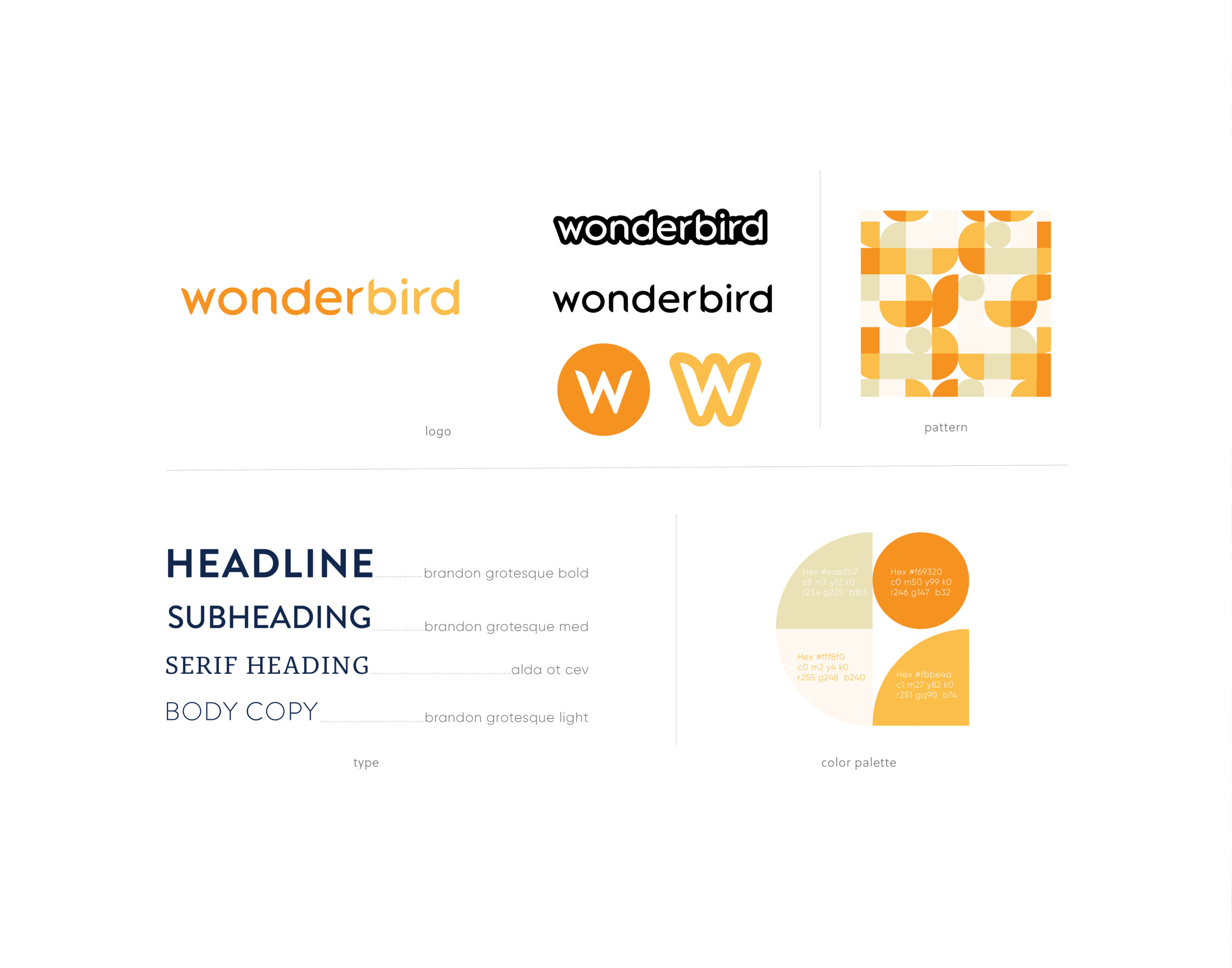
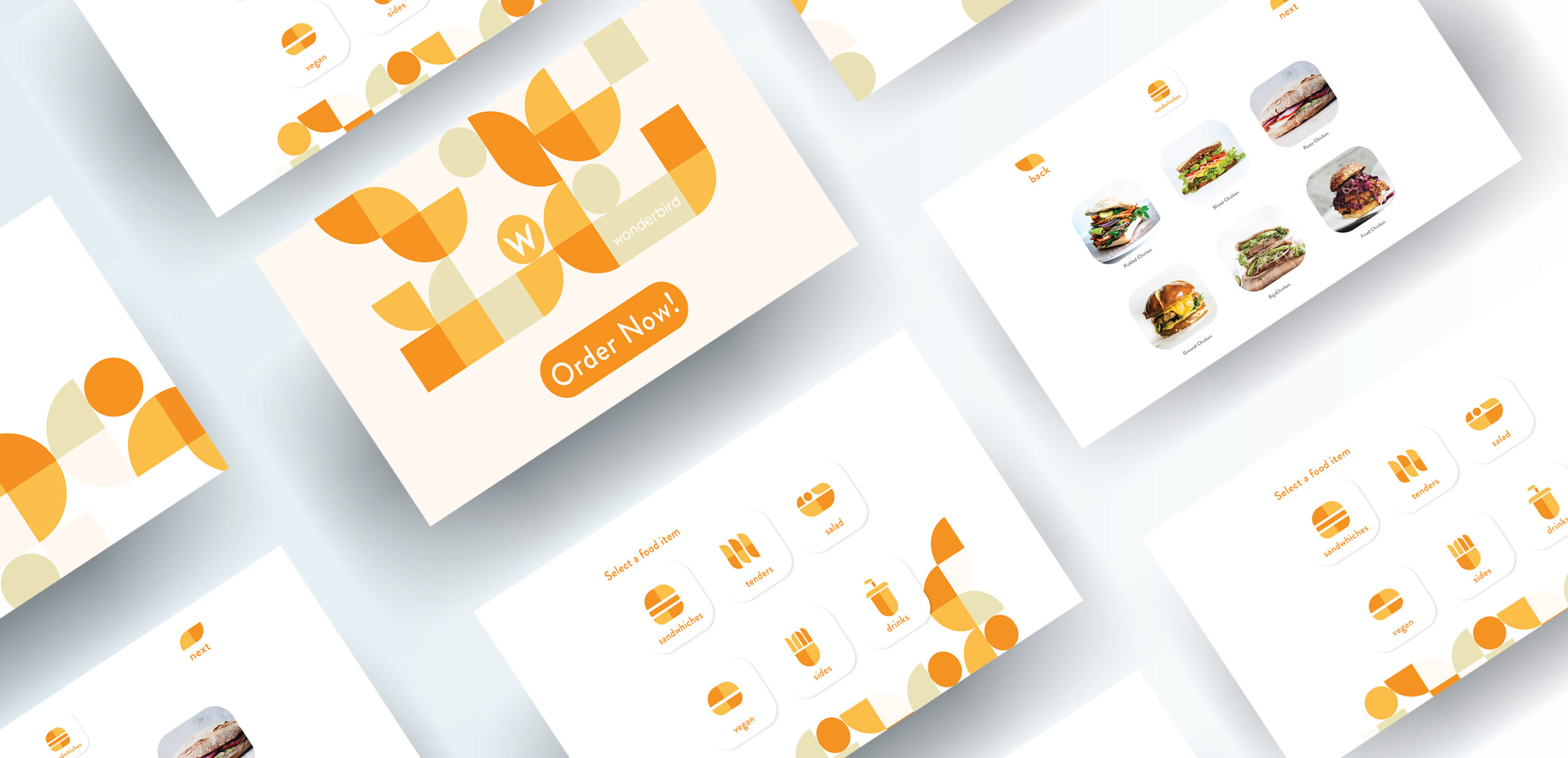
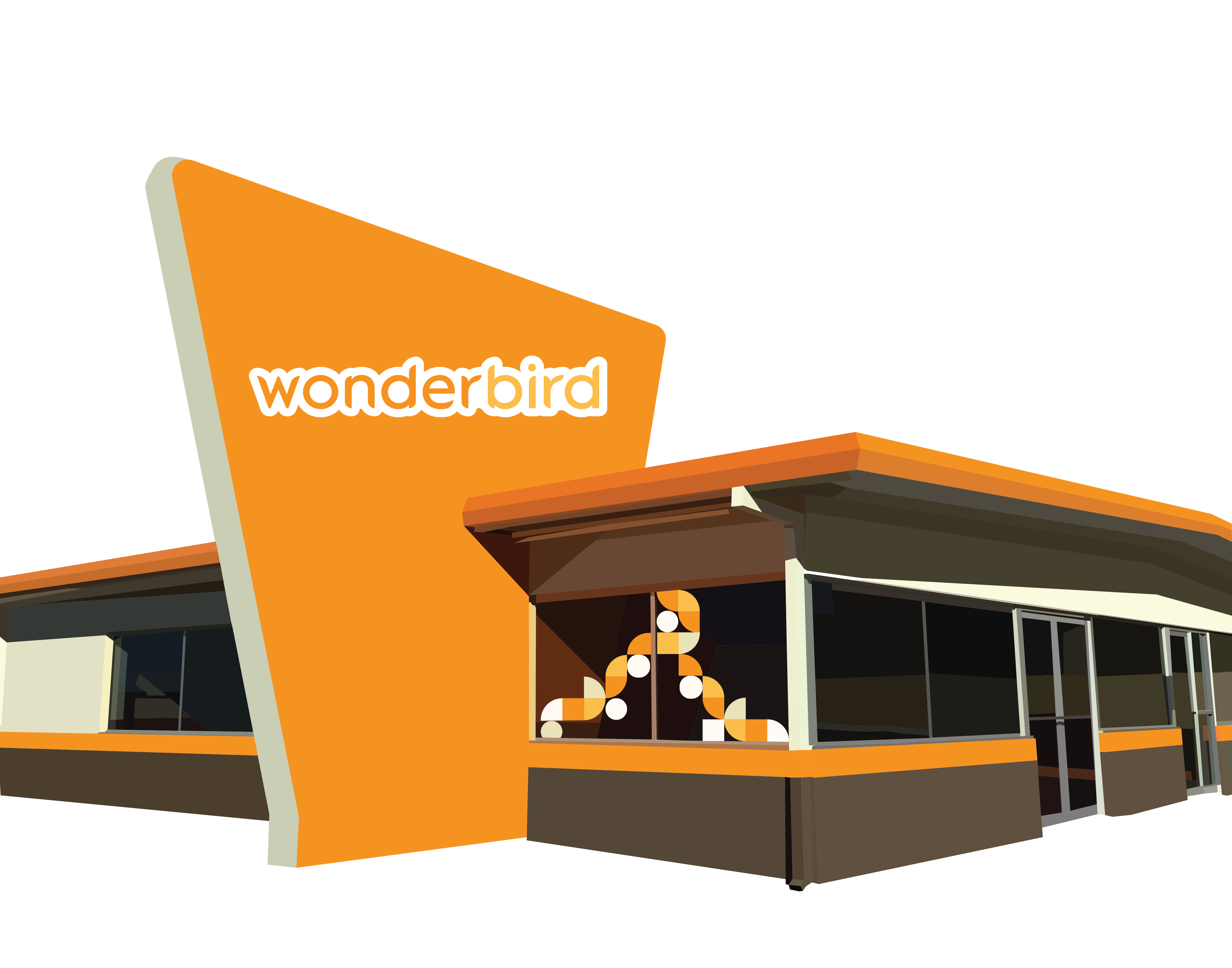
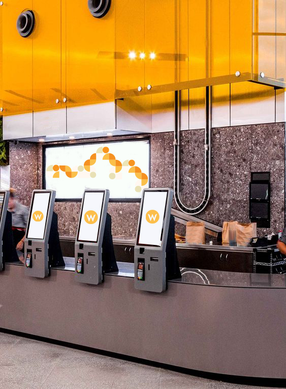
The brand identity for Wonderbird focuses on a modern and simplified design. The brand colors appeal to the hungry audience while also partially representing the chicken without every showing an actual chicken. The logo uses an original typeface that has rounded corners to mimic the look of a beck or the curve of the birds’ wing. Shapes create abstracted icons for all of the food served at Wonderbird. QR codes and Kiosk ordering stations replace the paper menu and ordering from a person. There is an online app that allows the customer to order online and skip the lines.